Intro
In our society we are all exposed to multiple forms of media. Our brain has to prioritize what our eyes will linger on and pay attention to. Certain visual elements and rules make specific magazine covers and spreads, social media posts, and advertisements pop out and stay in memory. This magazine spread harmoniously uses some of those rules and elements to catch the eye of so many viewers.
Typefaces
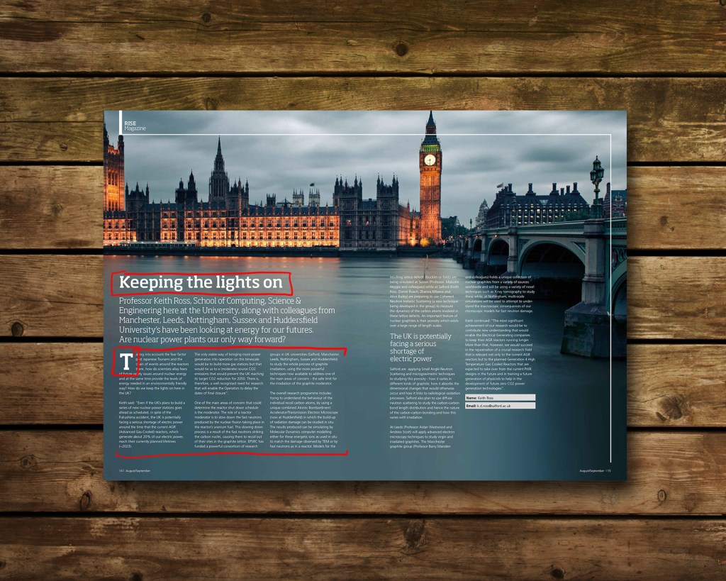
The use of different typefaces can catch the eye of any viewer if contrasted correctly. Typefaces can complement each other or conflict each other. To understand the contrast we need to identify what style of type is being used. The typefaces present in this magazine article are modern serif and sans serif.
The title is using a modern font which has a thicker body and hardly any tapering in line weight around the curves. It is fairly geometric and has wider, horizontal serifs.
The small text of the body copy is a sans serif font, identifiable by its geometric shape and the lack of serifs.
Contrasting Typefaces
The typefaces present are are often placed together because they are both appealing and functional, meaning they add to the over all visual look of the spread but can also easily be read. The modern type is wide and strong. The sans serif is light and thin giving rest to the eyes and even giving more emphasis and visual lingering to the modern type.

Photography
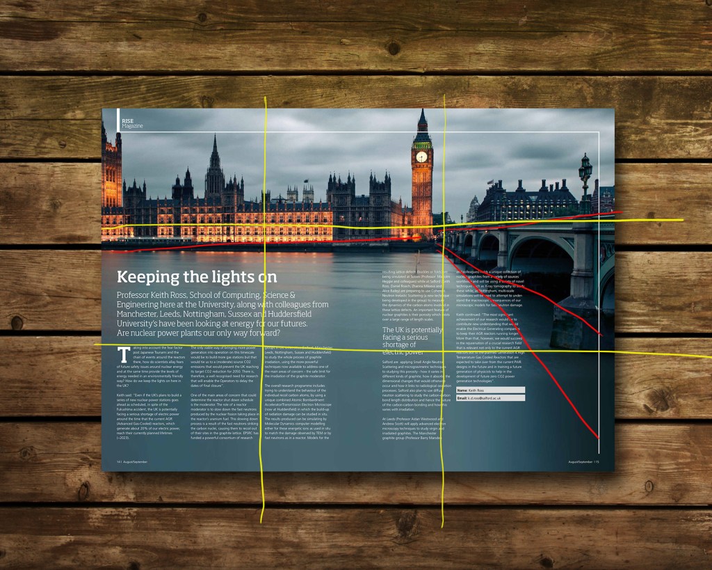
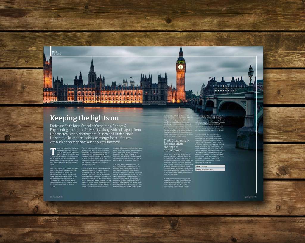
This image uses both the rule of thirds and leading lines to appeal to the viewer. The horizontal line across the horizon and the diagonal lines of the bridge and shadow on the water lead right to Big Ben, which holds the light. It is the point of highest contrast as well which also draws our eyes directly to it.
Alternate Images
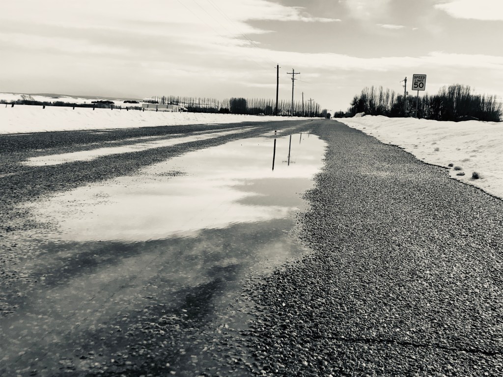
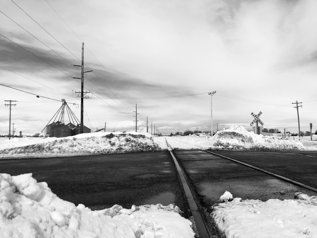
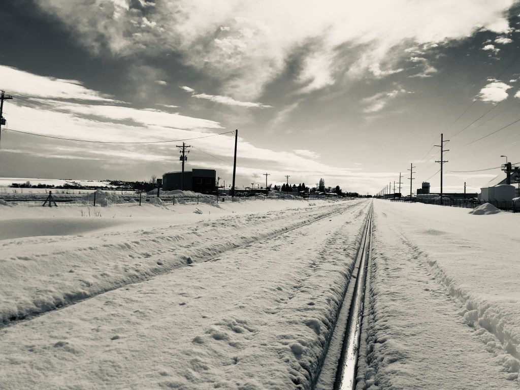
While analyzing this magazine spread, I started thinking about what the article was talking about and what I could grasp from just the title. I asked myself what other objects or landscapes could symbolize light? What could stand as a beacon? I concluded with what I have around me, I could us nature as the light. The sun is the ultimate light. These photographs are featuring roads and train tracks that lead off to something in the distance. The light is illuminated at that vanishing point and draws people to it, similar to Big Ben in the magazine. The leading lines of the bridge lead the eye to the light; the roads and the train tracks lead people to their destinations. Each other these photos incorporates natural leading lines and places that vanishing point on The Rule of Thirds.
Summary
More times than not, a photograph will catch the eye more than a group of text will. Depending on the success and the impact of the photograph, the audience will linger and study it or they will move on. This magazine spread is successful because it includes and image that uses leading lines and the Rule of Thirds. It also uses contrasting typefaces that compliment each other, modern serif and sans serif, so that the reader can understand the importance of the information while sensing a professional influence. The typefaces are easy to read and they don’t stand in each other’s way.
