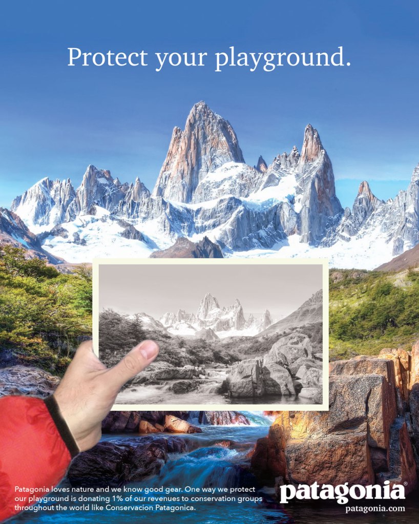
Patagonia is a family centered adventure company that provides an emotional tie to nature through their equipment and clothing. The ad below is the original Patagonia Ad, designed by Olivia M. Wong. We are going to pull apart the elements of design that make this ad successful and then compare it to a new ad created in the same style as this.
Designer | Olivia M. Wong
Contrast
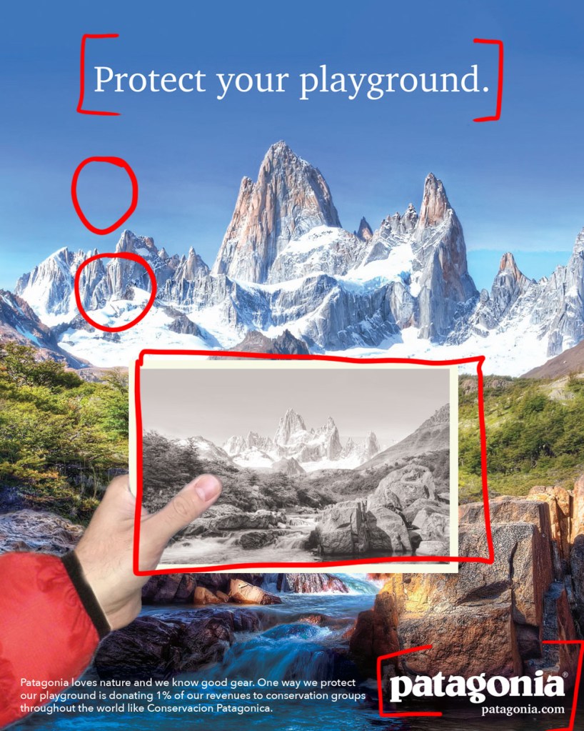
This ad has quite a bit of contrast which helps some elements pop out more than the others. The biggest contrast is in the mountains. That is where we can see the darkest darks and the lightest lights. There is also contrast where the text is placed. It is a good contrast in color which makes it more readable.
Repetition
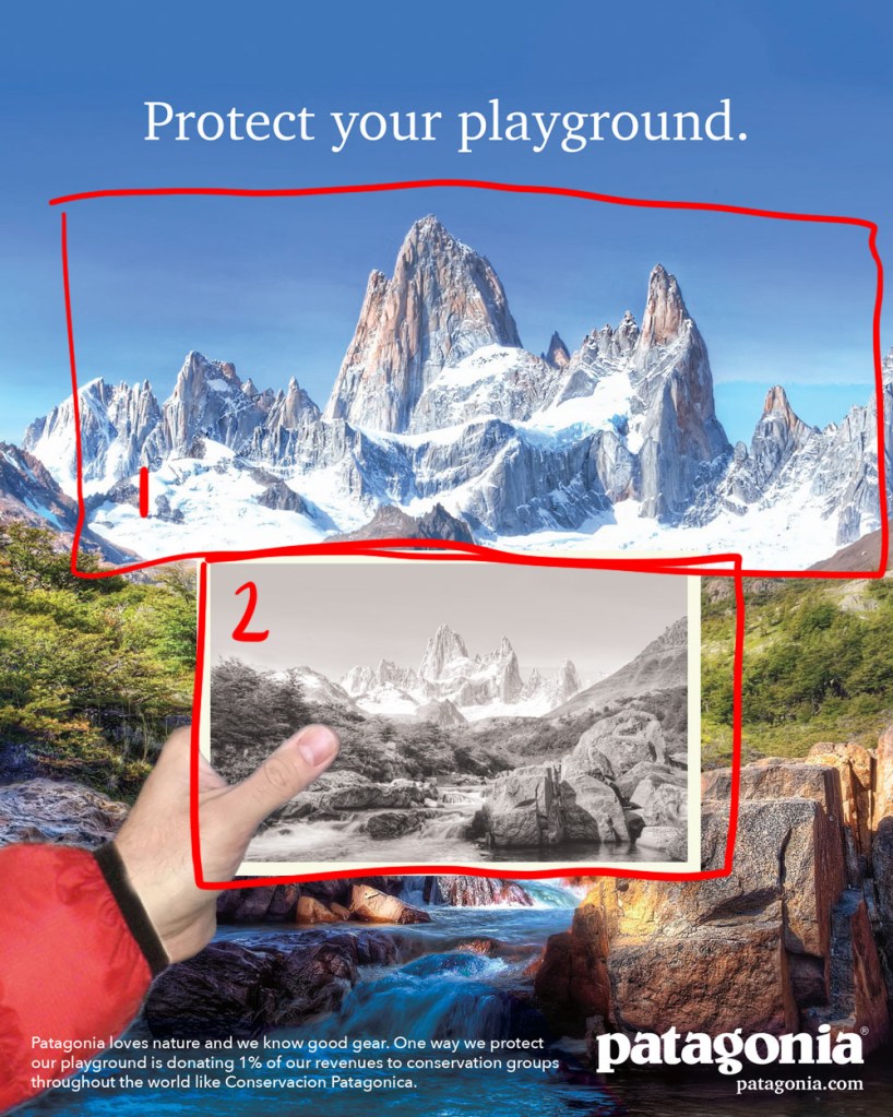
Repetition is quite obvious in this advertisement. The black and white photo is a repeat of the view in the background. The mountains, the greenery, the rocks in the water are all repeated.
Alignment

A lot of the subjects or pockets of visual interest are sectioned out evenly. The text at the top of the ad create a nice horizontal line, the top of the photograph and the greenery create another horizon line, and the text as the bottom create a nice horizontal line as well. The photo is centered with the mountains in the background, giving the viewer a straight line down for their eye to follow.
Proximity
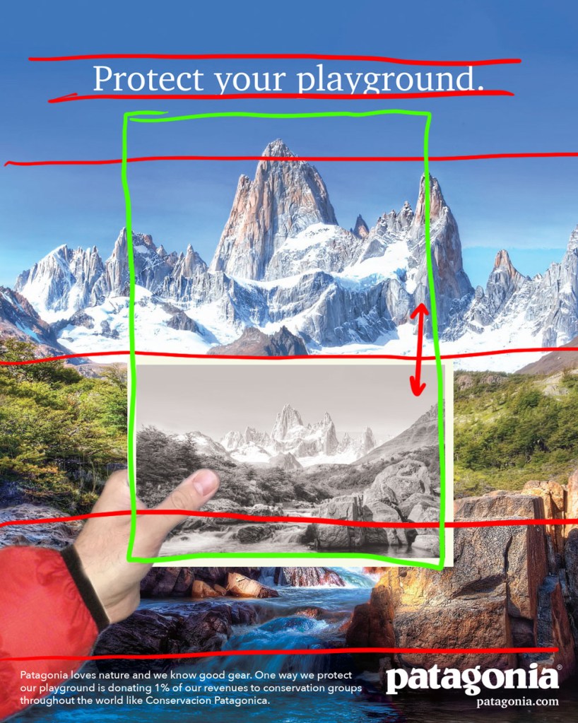
The central focus of the ad is in the center, consisting of the photo and the view behind it. This is scene in the green box. I think the black and white photo is in a good proximity to the mountains behind it because then our eye has a clear line to follow. It sets us up to feel like we are there seeing this view that has been through generations.
Color
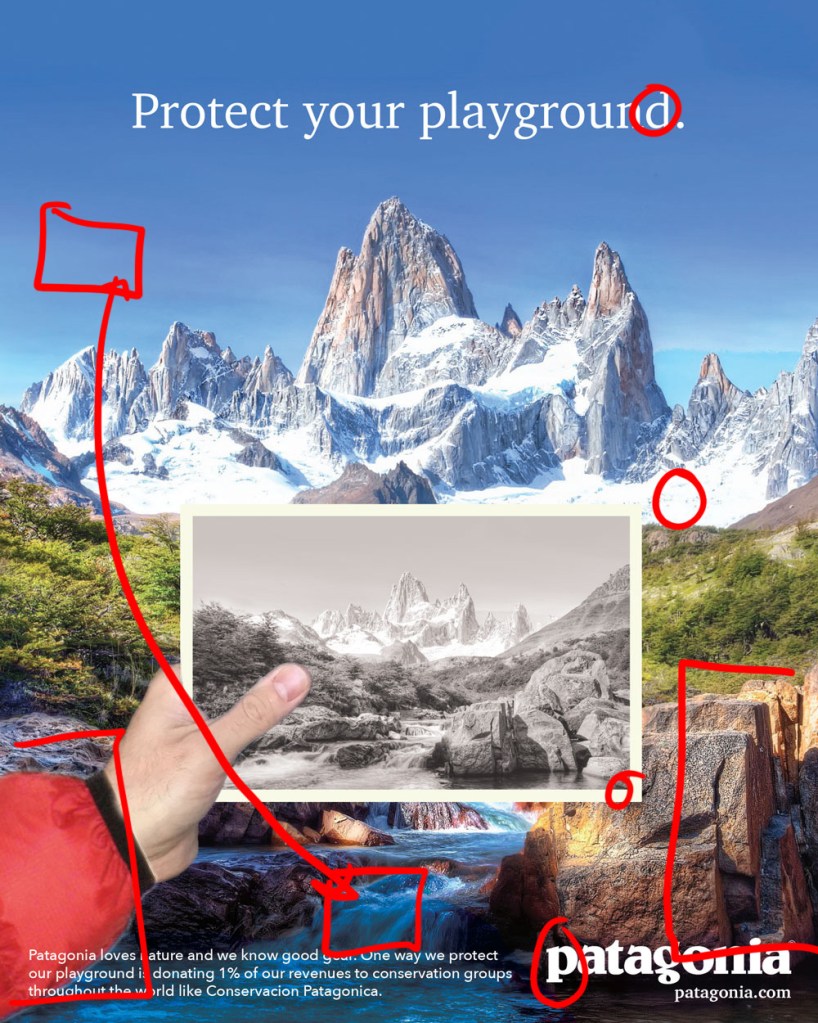
There isn’t a wide variety of color in this advertisement but they are complementary or of the same natural environment. The red of the jacket in the left hand corner seems to stick out because it isn’t repeated anywhere else but it compliments the color green very well. The blues in the sky and water are similar enough to create come unity as well. White in the text is a good repeat from the snow in the mountains.
Typography

There wasn’t a lot of typographical texture in this ad but it still got the job done. The serif in the top text might have done better as a slab serif so that it fit more with the Patagonia logo but the serif still gives this a professional and nostalgic tone to the whole ad. The sans serif in the body text is a great choice to keep the noise down but still allow it to feel modern and minimalistic. The logo itself gives some good variety and draws attention to itself.
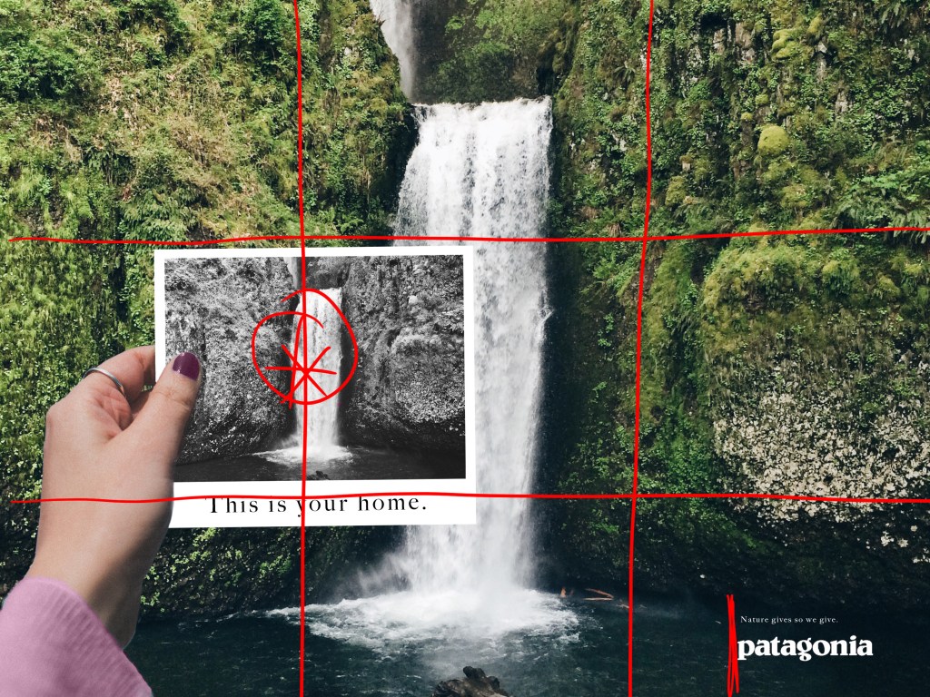
Patagonia Ad Reinvented
I created a new advertisement for Patagonia using the same style as the first ad. This is the result.

Contrast

The biggest area of contrast is in the waterfall and the pools below it. It really centers the whole advertisement. The Patagonia logo in the bottom right hand corner also has really good contrast. This helps draw more emphasis and attention to it. The black and white photograph of the waterfall also has good contrast as well as it highlights the darkest and lightest parts of the environment behind it.
Repetition

As in the advertisement before, the black and white photograph is repeating the scenery behind it. The typography on the photograph is also repeated in the body copy above the Patagonia logo.
Alignment
I placed the black and white photograph along the Rule of Thirds to draw more attention to it and add visual interest. I aligned the body copy text with the Patagonia logo in the bottom right hand corner.
Proximity
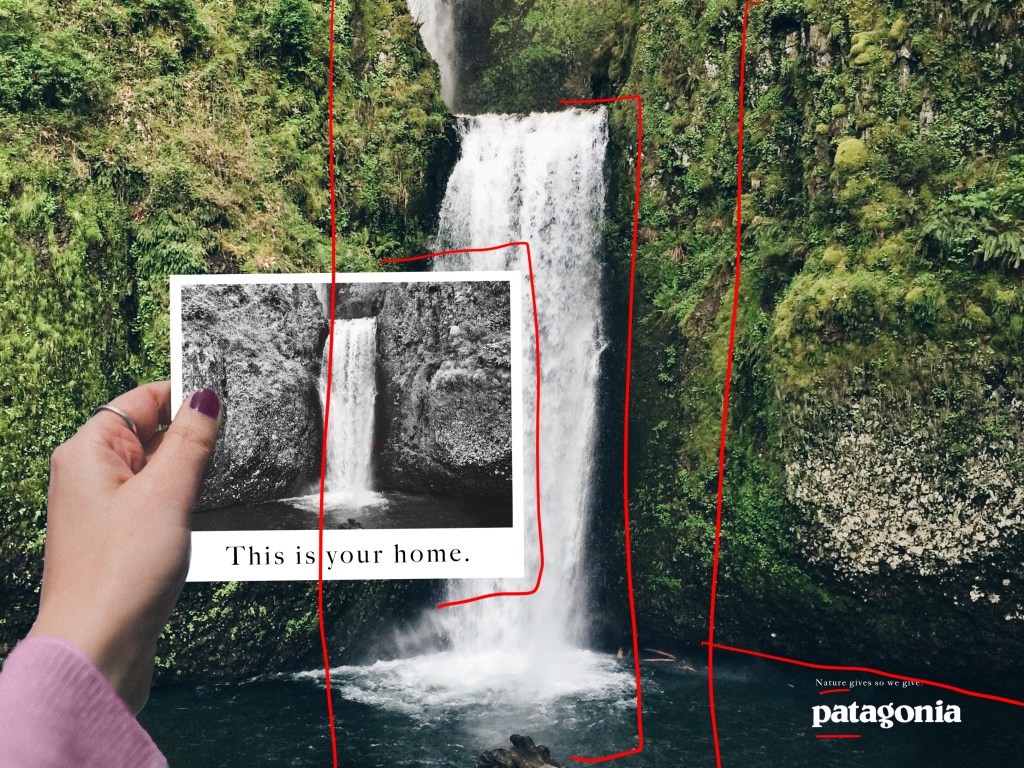
The photograph is off centered to show more of the waterfall and add more visual interest. The placement of the Patagonia logo and the body copy in the lower right corner optimize the contrast
Color
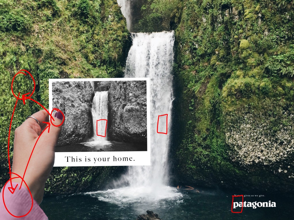
The color is repeated across the ad. White is taken from the waterfall and the white in the photograph. Although the pink sleeve is the one of two places with the same color, it compliments the green in the cliffs behind the hand holding the photograph. The pink color is repeated to give a little more unity as well.
Typography
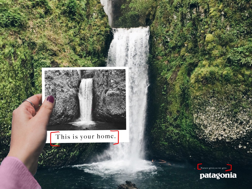
I wanted to simplify the typography so that it matched the simplistic tone of the scene. The type on the photograph is the same serif font in the body copy, located above the Patagonia logo.
Conclusion
This original ad communicates the timeless value of nature and the beautiful environment that we get live with. Patagonia keeps that value of nature strong and preserve the vital connection to it. The ad that I created also conveys this message of nostalgia. I claim that nature is our home which also stands as a timeless statement. It gives that family centered company tone that will encourage the customers to keep the environment alive throughout all generations.
