
Ad Published May 05, 2019
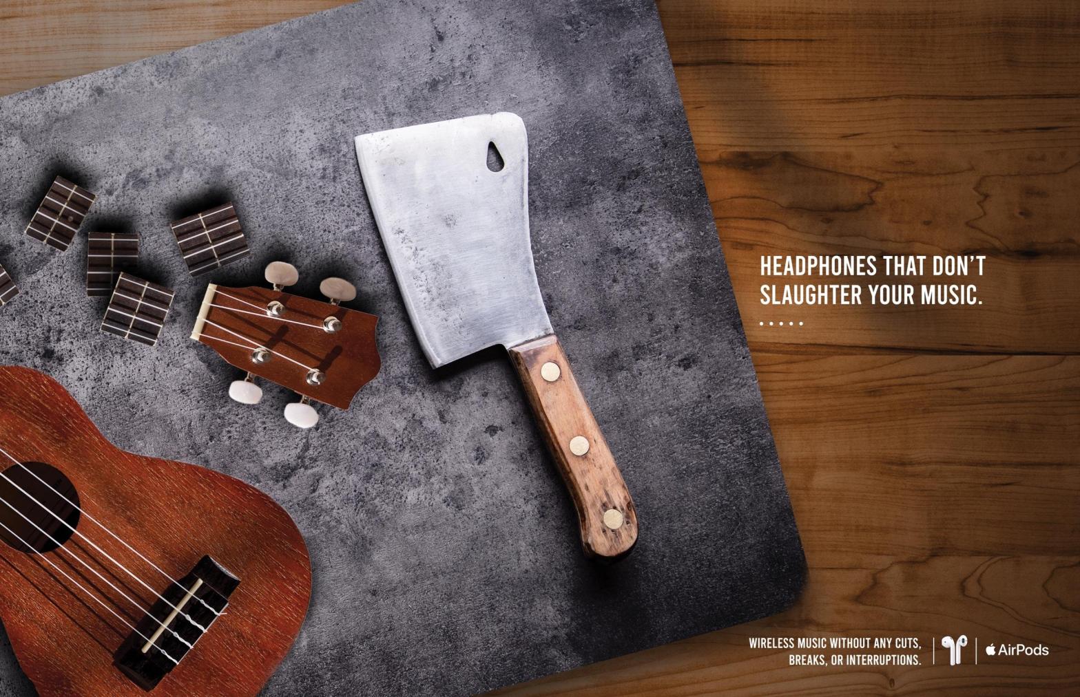
Apple is known for their technological products that have changed the way we work, the way we learn, and the way we hear sound. This ad from May of 2019 hopes to demonstrate a metaphor for other competing wireless headphones that constantly glitch, or experience interruptions. The Apple AirPods, on the other hand, are the brand that claims they are the only wireless headphones that allow a smooth stream of music. This post will analyze the design elements used and the effectiveness of them.
Contrast
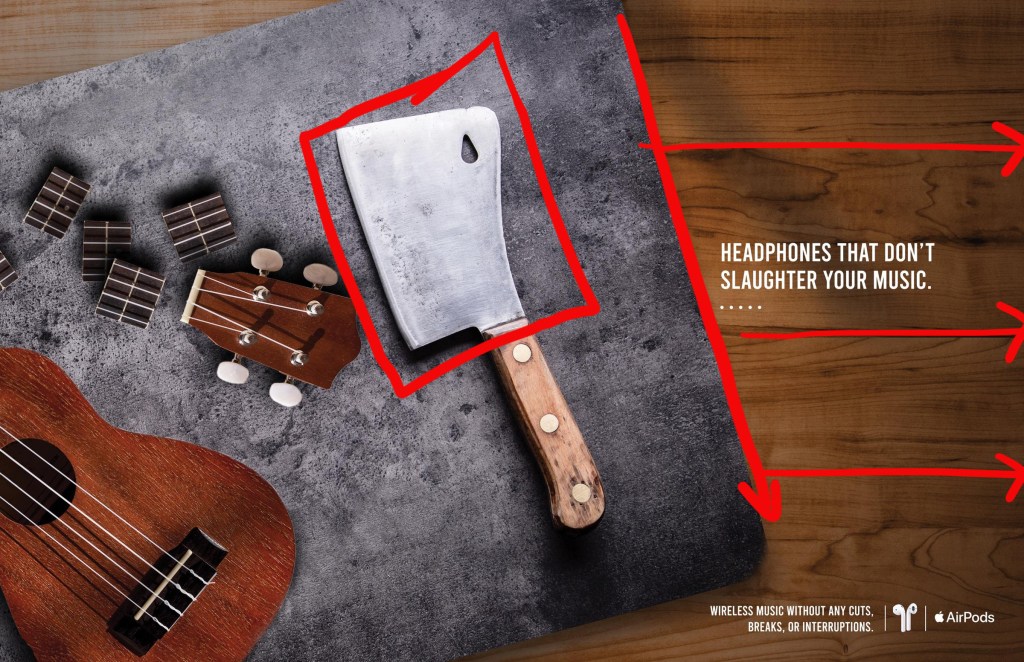
In the background of the image we see the strong, horizontal lines of wood. The diagonal line the cutting board creates disrupts the smooth surface of the wood table. The texture of the wood table and the stone cutting board serves as a nice contrast as well, giving the ad a little more visual interest. The blade of the knife is very light in comparison to the darker stone it rests on. It is also a large object that contradicts the smaller pieces of the ukulele that was chopped up.
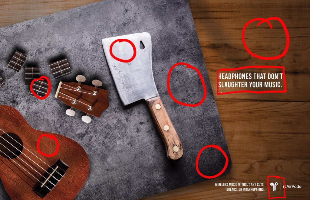
Repetition
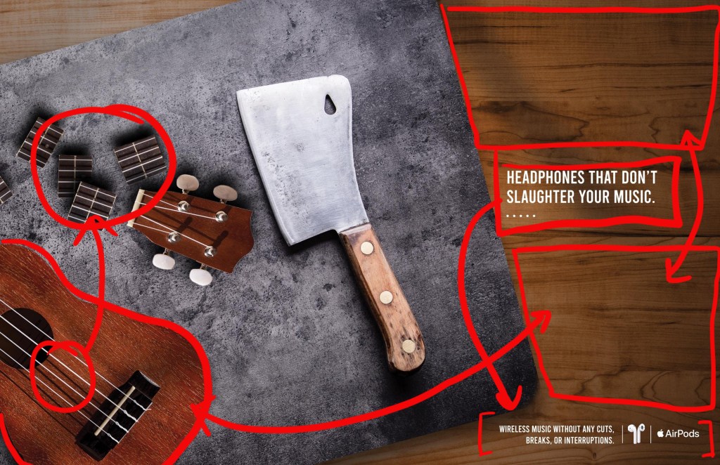
In this ad, textures are repeated, typeface is repeated, color is repeated and negative space is repeated. Starting on the left side of the ad, the strings on the ukulele are repeated in the cut up neck pieces. The ukulele chosen to be used is wood, which is the same texture that is used in the background of the entire ad. In the background, there are is a similar amount of space between “Headphones that don’t slaughter your music”, the top of the page, and the description at the bottom of the page along side the image of AirPods and the Apple logo. The text use the same font family which also created good unity. They feel like they belong in the same ad. Those texts are also white, similar to the almost white color on the blade. This also repeats in Apple’s logo and the color of AirPods they chose to feature in this ad.
Alignment
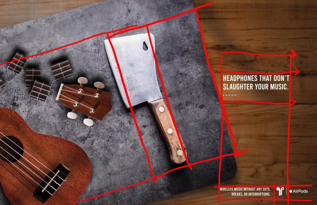
Each element is laid within a grid of sorts that connects it to some other element in the advertisement. The knife aligns in a nice parallel to the diagonal edge of the cutting board. The ukulele and the neck pieces all fall in the same rectangular grid which keeps them in an organized area. The text boxes align with each other almost perfectly but close enough that our eyes can associate them with each other. The text also aligns with the natural horizontal lines of the wooden table behind them.
Proximity
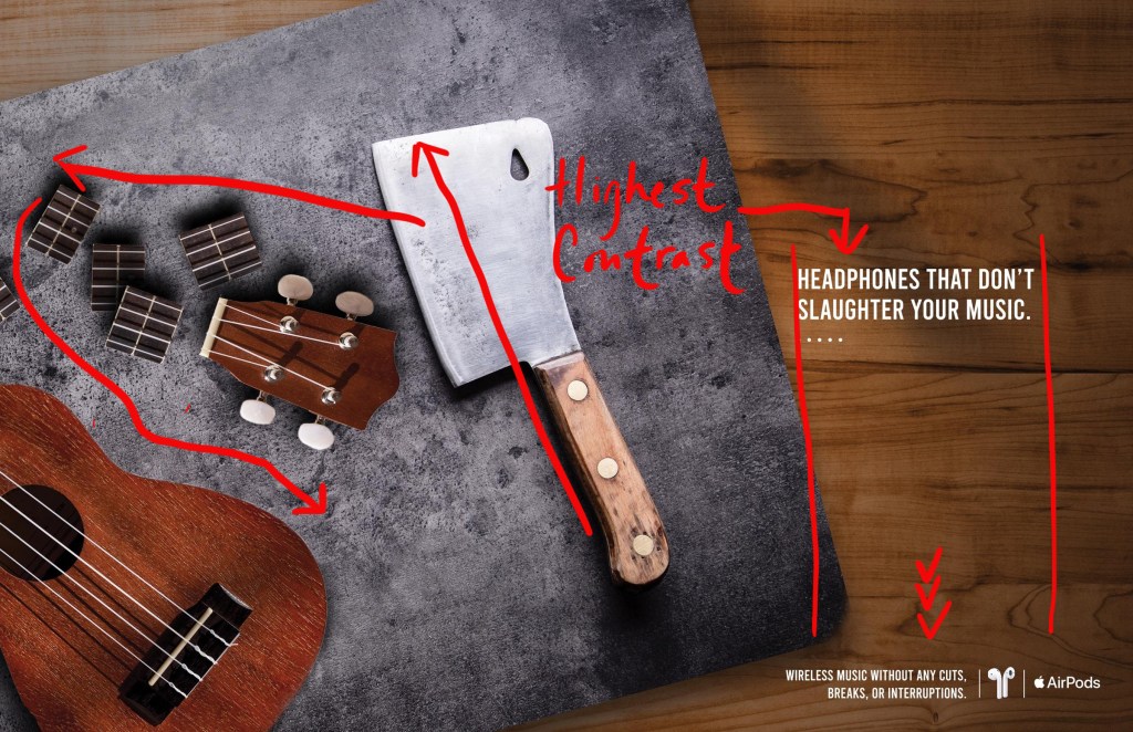
The elements in this ad are strategically placed to create a visual path for the viewer’s eyes to follow. The highest point of contrast will be either the white text (Headphones that don’t slaughter your music) on the wooden table or the blade on the cutting board. From either point we can follow the angles down to the white text in the bottom right corner or follow the lines the ukulele neck has created and then down the body of the ukulele back to the text in the lower right corner. The blade of the knife is also facing the ukulele and the chopped up pieces which points our eye in that direction. The blade is also in the center of the page horizontally and vertically. The white text is horizontally centered as well. This is another reason that it will most likely be the first element the viewer sees.
Color
The a basic three colors that this add uses. Brown, gray, and white. Different hues, shades and tints are obviously present but in the entirety those basic three colors create unity. These colors are more earth tone and naturalistic, suggesting to the viewer that it is only natural to use the best wireless headphones available. There is a darker tone to the ad suggesting that the slaughtered musical instrument is not the type of music anyone would like to listen to.
Conclusion
All of these elements work together to create a successful and visually interesting advertisement for Apple AirPods. The contrast in texture and color help give the audience more than just a monotone conversation. But that texture and color also are repeated throughout the ad which unifies it as a whole and makes all the elements feel like they belong in the ad. The location, proximity and alignment, of each element is crucial to the communication of the ad because it will help indicate the first place the viewer will look, and if that isn’t interesting the viewer won’t be spending much time looking at the other information it holds. The unity and flow of the ad upkeeps the professional tone that Apple has built for themselves and thus establishes more trust in their products.
